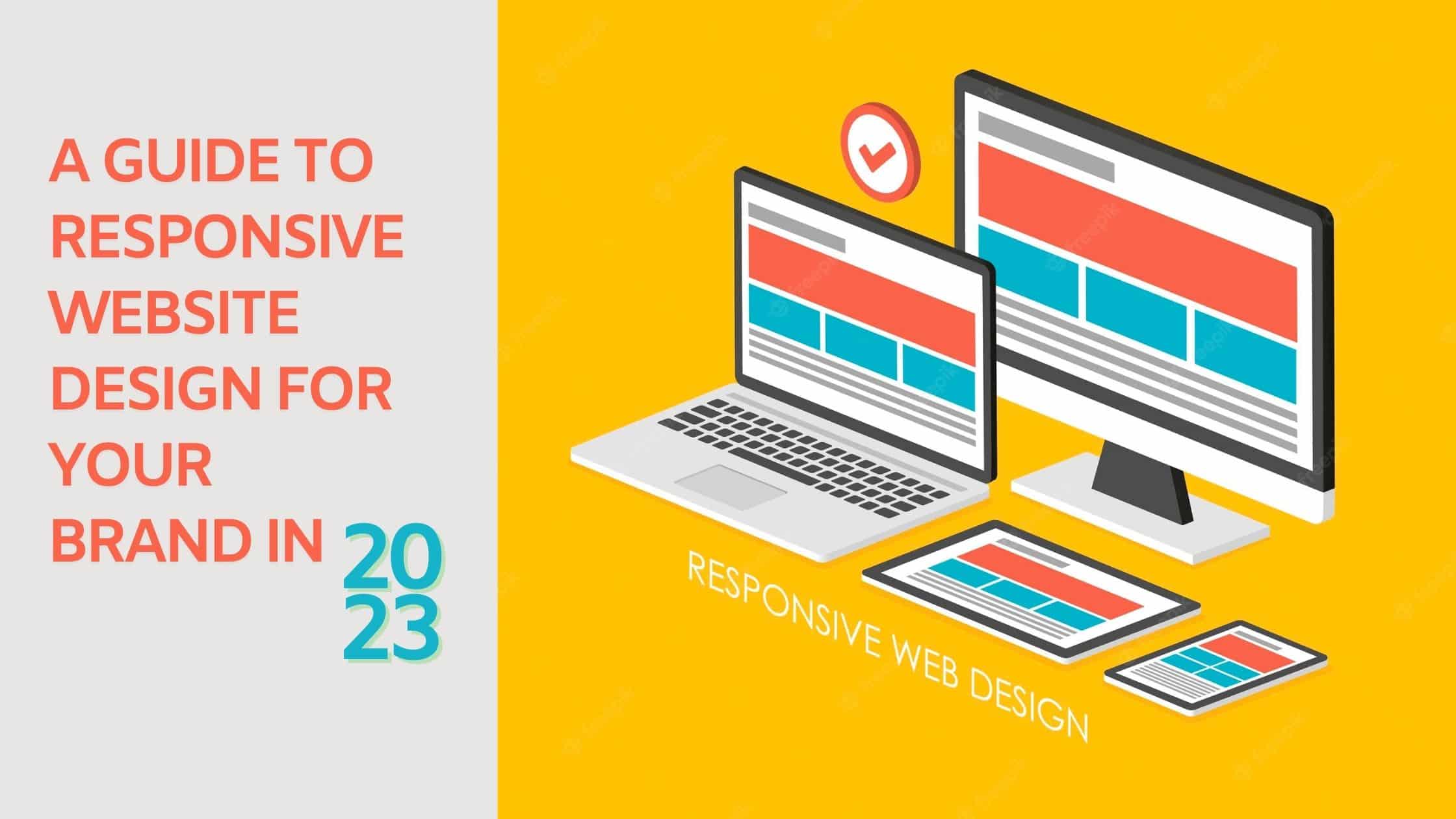
The ongoing era of the internet has repeatedly stressed the need to have a dynamic and mobile-friendly website for your brand. According to available data from a website design and development company in Mumbai, 50 per cent of the current traffic has been identified to mobile devices in the world. Furthermore, this percentage is expected to rise to 75% by the year 2025. It implies that if you want your brand to succeed in its market, it is imperative to have a responsive website design for continued customer engagement.
What does a responsive website mean?
As per the website developer and expert professionals from various responsive website and development companies in Mumbai or any other part of the world, if your brand has a customized and optimized webpage layout that fits any device your customer prefers, it can be called a responsive website. According to available data, the standard and most common resolutions for a responsive website for various high-tech devices like mobiles, computers, laptops and tablets are:
- 360×640 (small mobile): 22.64%
- 1366×768 (average laptop): 11.98%
- 1920×1080 (large desktop): 7.35%
- 375×667 (average mobile): 5%
- 1440×900 (average desktop): 3.17%
- 720×1280 (large mobile): 2.74%
It does not mean reducing the content or product pages for your brand. If you hire the right website design company for brand promotion, then it indicates a big improvement in customer experience. It implies better user conversion and good business growth.
Key design terms of a responsive website
Before you assign your brand’s website to a reputed design company across the country, it is necessary to be familiar with a few key terms associated with it, particularly if you are from a non-technical background or have just ventured into business. These are as follows:
- Fluid grids: It is an element having areas in rows and columns where content can be added. It can be set to auto-fit or adjusted across the breakpoints
- Breakpoints: These are specific points in the screen size where a website gets triggered to adjust to its layout
- Overflow: These are the elements that exist outside the container or happen to be too large or are present outside the viewport
- Viewport: This is the visible area where a customer can see content on his device
- Flexible images: Responsive images on your website ensure they are not pixelated or slow down your brand’s website loading on the customer’s device
- Relative sizing and Fixed sizing: Relative sizing means that the size changes into another element in layout as per the user’s device whereas fixed sizing means it remains constant irrespective of the device
- Hamburger menu: This is a menu button that enables a drop-down for the navbar links to save space in restricted designs
- Mobile-first: It is a design strategy that is focused on the layout for the most-restricted version to make the responsive website mobile-friendly as compared to other devices
Popularize your brand with our services!
Ambest Brand Communication Agency is the most versatile and efficient website design and development company in Mumbai that has catered services to multiple brands. We have a sound understanding of what a brand needs to reach its target audience and give your business a deeper emotional connection with them with immensely creative outputs. Make your brand big by taking our services at budget-friendly prices. Connect with us for excellent business growth!

I have read your blog it is very Informative but it seems like you have missed some point.
In 2023, having a mobile responsive website is more important than ever for businesses. Here are some reasons why:
1. Mobile internet usage is growing
2. Improved user experience
3. Better search engine rankings
4. Competitive advantage over businesses that don’t have a mobile responsive website.
It was an awesome time reading your blog which gave important information. But according to me, you have missed out on some of the other points which I have mentioned here.
1. Mobile usage is on the rise
2. Improved user experience
3. Higher search engine rankings
4. Increased conversions
It explains why it’s crucial to use responsive design, what factors to think about, and how to put it into practice effectively. This post offers helpful advice and illustrates the effect of responsive design on UX and SEO with examples. The article guarantees that companies are up-to-date on the current developments by discussing the specific factors to be taken into account in 2023.
Navigating the guide to responsive website design for 2023 is incredibly enlightening. With the growing mobile user base, the focus on “thumb-friendly” navigation is a crucial consideration. Adapting the user interface to different devices ensures a seamless experience, regardless of how users access the website.